Last time, I cut my website down to one message: Less noise. More clarity. I knew what it was for before I ever opened a design tool.
This week, the fun part: what does it actually look like?
And that’s where it got tricky. It comes down to a tension every designer knows. Cool vs. clear.
I wanted a wow factor
My first instinct? Show off. I wanted my own site to prove my taste. Futuristic. Motion. Something in 3D you can grab and spin. I actually wrote this in my notes:
Like a concept car that’s not for sale for another 10 years.
There’s nothing wrong with that. The whole point of this site is to make someone who just met me go “okay, this person knows what they’re doing.” A boring site won’t do that.
The trap
A business card has one job: you get it in seconds. And “futuristic” can quietly break that.
Someone lands, thinks “wait, what is this?”, and the wow just backfired. A confused visitor doesn’t hang around to figure it out. They leave.
That’s the trap good-looking websites fall into. Cool gets in the way of clear.
Designers even have a name for it: the aesthetic-usability effect. We forgive good-looking things, but only so far. Pretty buys you patience for the little stuff. It won’t save you when someone can’t tell what they’re looking at.
There’s a second trap: too much motion and animation can slow a site to a crawl. A concept car that takes 8 seconds to load is a dead concept car.
So I stopped treating them as opposites
I sat with that trade-off for a bit. Turns out, the wow is the clarity.
So that’s what I did. I made the motion do the explaining, not just decorating.
What that looks like on the actual card
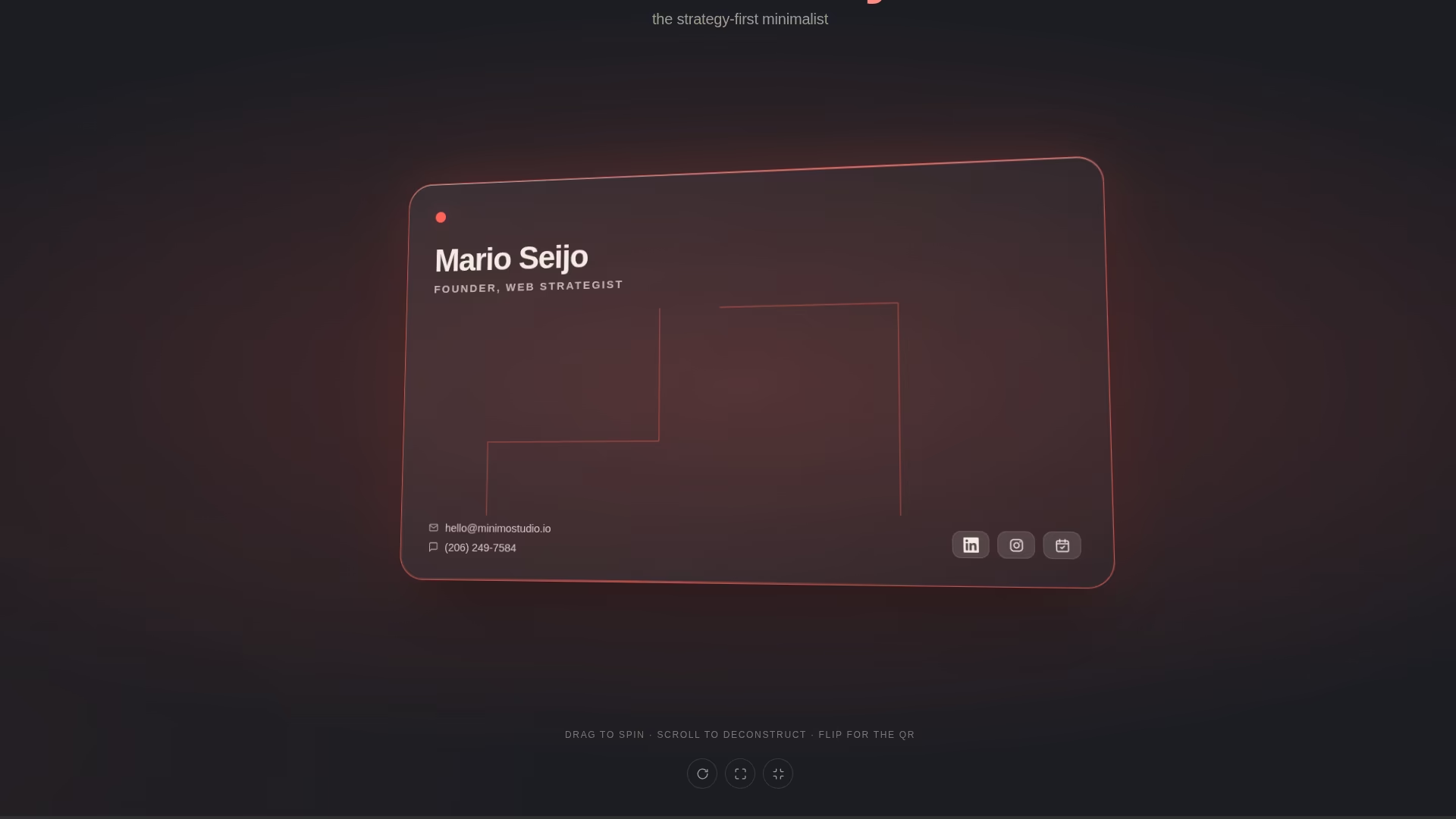
The site is a business card, so I made the hero literally one. A big piece of translucent glass you can pick up, spin, and flip. That’s the wow.
Then I almost blew it. My minimalist instinct was to keep the front bare. Just my name and a few details, super clean. But a business card you can’t actually contact anyone from? That’s just a nice-looking object. So my email and phone sit right there on the front, tappable. Tap the email, your mail app opens. Tap the number, you can text me. Flip it over and there’s a QR code and a save-to-contacts button, because that’s what you do with a card someone hands you.
Every piece earns its spot.
At rest, the card just sits there facing you, square and easy to read. Then it slowly wobbles from side to side. That’s your cue that something’s going on here. Come play with it.
Why this matters for you
So next time you (or whoever’s building your site) want to add a cool 3D animation or motion effect, ask yourself one thing:
Does this help someone understand you faster, or does it just look impressive?
If it does, keep it. If it only looks nice, it’s noise, and it’s quietly costing you the clarity you were going for.
The best websites aren’t the ones with the most going on. They’re the ones where everything on the page is doing something, and adding value.
Next up, the part that surprises people. Before my site was ever a web page, it was a folder of plain-text files. The whole thing, written out in words first. That’s where the work actually happens, and that’s the next post.
Anyway, this is how I work at Minimo Studio: strategy first, design later. I’m just doing it on myself, in public, so you can watch.
Less noise. More clarity.