Last week I confessed that I build websites for a living, and my own is a dusty mess. I said I’d refuse to design anything until I answered one question: what is this site even for?
This week, I actually sat down and answered it. No design tools open. Just me, a blank document, and that one question. Here’s how it went.
The question almost everyone skips
Most websites get built backwards. You pick a template, fill in the pages the template gives you (Home, About, Services, Contact), drop in some photos, and call it done. It looks like a website. But nobody ever stopped to ask what your website is for.
So you end up with a nice-looking brochure that doesn’t actually do anything. It’s not that the design is bad. It’s that there was no job underneath it.
A website without a clear job is just decoration. And decoration doesn’t bring you leads, donations, or new clients. It actually costs you: users decide whether to stay within about 10 seconds, and if your site doesn’t show them why it’s worth their time, they’re gone.
A site that tries to do everything does nothing
When I asked myself what marioseijo.com is for, my first instinct was to make it do everything. A portfolio. A blog. A résumé. A place to book me. A highlight reel of every skill I have.
That’s the trap. A website with five jobs has none. Every job you add makes the next one blurrier, until a visitor lands and has no idea where to look or what you want from them. So they leave.
So I forced myself to pick. One job.
Three questions that got me there
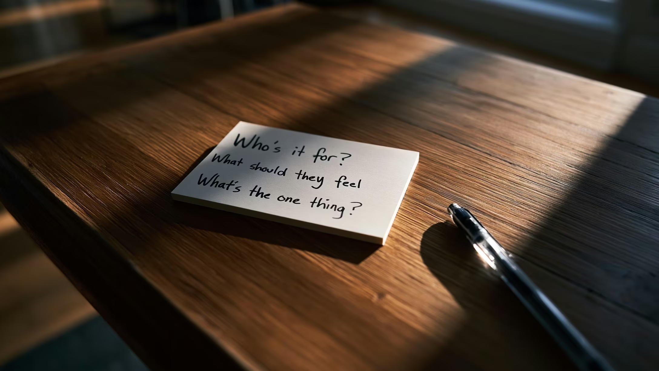
I didn’t overthink it. I answered three plain questions:
- Who actually shows up here? For me, it’s people who just met me (at an event, through a referral) and looked me up that same night.
- What do I want them to feel? A little wow, and that I’m someone worth knowing.
- What’s the one thing I want them to do? Connect with me.
Notice what’s not on that list: buy something. That’s not this site’s job.
My answer: it’s a digital business card
Here’s where I landed. marioseijo.com is a digital business card. Its one job is to control the moment someone Googles my name after we’ve met: to help them remember me in about ten seconds, then point them somewhere useful.
I thought getting clear would add to my to-do list. It did the opposite. The second I knew the site’s one job, I started cutting things I’d assumed I needed. No giant portfolio. No blog living here. No services menu.
That’s the quiet magic of strategy first: it tells you what to leave out.
Why this matters for you
Before you redesign anything, before you touch a color or a font, answer the question for your own site. What is your website for? Who shows up, what do you want them to feel, and what’s the one thing you want them to do.
Get that answer, and every decision after it gets easier. Skip it, and you’ll build a beautiful brochure that quietly does nothing.
Next up, the part that genuinely hurt: now that I knew the site’s job, I had to figure out the one thing it actually says. Cutting five messages down to one is harder than it sounds, and that’s the next post.
This is how I work at Minimo Studio: strategy first, design later. I’m just doing it on myself, in public, so you can see it in action.
Less noise. More clarity.