Last time, I wrote about The Trap Good-Looking Websites Fall Into. This time we go further back, to where this whole thing actually started, and the part of my process that surprises people most.
Before my site was ever a web page, it was a folder of plain-text files. No design tool. No page builder. Just words, typed into documents, weeks before anyone could look at a screen and call it a website.
That’s not me being quirky. It’s the whole method. Content before design. Let me show you what that actually looks like.
The site exists as a pile of text files
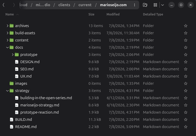
Right now, marioseijo.com lives as a handful of plain markdown files sitting in a folder. There’s one for the strategy (what the site is for). One for the content (every word that appears on the card, plus my real contact details). One for the design system. One for how it behaves when you touch it. One for the SEO.
Open any of them and it’s just… writing. My headline, Less noise. More clarity., existed as a line of text in a file long before it was ever big and centered on a screen. The card’s contact details were a bulleted list before they were tappable. The whole site was readable, and decided, as words first.
Only then did a single pixel get drawn.
Why not just open a design tool?
Because a design tool tricks you into feeling productive while you avoid the actual work.
You start pushing boxes around, picking fonts, nudging colors, and it feels like progress. But you’re decorating a container before you know what’s going into it. Nine times out of ten you end up bending the message to fit a layout you happened to like, instead of the other way around.
There’s a line about this I’ve never forgotten, from web designer Jeffrey Zeldman: “Content precedes design. Design in the absence of content is not design, it’s decoration.”
That’s the trap. When you don’t have the words first, you’re not designing. You’re just making decoration and hoping a message shows up later.
Plain text exposes a weak message
Here’s the quiet magic of writing a site in plain text: it strips away everything that lets you fake it.
There are no fonts to fall in love with. No colors to fiddle with. No animation to distract you. It’s just your ideas, in words, on a plain background. If the message is weak, plain text shows it to you immediately, because there’s nothing pretty to hide behind.
That’s uncomfortable in the best way. When I cut my five messages down to one (that was a whole earlier post), I was doing it in a text file. When I couldn’t make my credibility line land, I could see it was clunky the second I read it back, because there was nothing else on the page to blame.
Plain text forces clarity. Which, if you’ve been following along, is the entire point of this site.
The thinking is right there in the file
The other thing plain text does: it remembers why.
Scroll through my content file and you’ll find little notes to myself, right next to the copy. One of them tracks a decision I went back and forth on: I originally had a bold “Save my contact” button on the front of the card. Then I demoted it to a small icon. Then I removed it from the front entirely and moved it to the back.
The reason is written down: a big “save” button was competing with the one thing I actually want people to do, which is connect. So save lives on the back now, where saving is the whole point, and the front stays clean.
That’s not a comment about code. That’s my strategy, thinking out loud, preserved in the file. Six months from now I’ll know exactly why the button is where it is. Try getting that out of a design tool.
Why this matters for you
You don’t need to write markdown to steal the useful part of this.
Before your next website, or landing page, or even a single “about” section, try writing it out in the plainest document you have. No design. No template. Just answer, in words: who is this for, what’s the one thing they should understand, and what do I want them to do next.
If it reads clearly as plain text, the design’s job gets easy, because the hard part is already done. If it doesn’t read clearly as plain text, no font in the world is going to save it. You just found your real problem before it cost you a redesign.
Words first. Every time. The prettier the tool, the more it’ll tempt you to skip this, and skipping it is exactly how you end up with a beautiful site that says nothing.
There’s one more reason my whole site lives as text, and it’s the part people either love or find slightly unhinged: I’m not the one turning those files into code. AI is. That’s the next post, and strategy-first is exactly what makes handing it over safe.
This is how I work at Minimo Studio: strategy first, design later. I’m just doing it on myself, in public, so you can watch. If you’re staring at your own site wondering where to even start, that’s what a Fit Call is for.
Less noise. More clarity.